redesigning Warby Parker
Side Quest
objective
Create a new visual design strategy for Warby Parker
description
First project in a visual design course focused on creating a visual design strategy to achieve an organizational mission. For this first project we were all tasked with the same prompt, redesigning Warby Parker by looking at the company mission statement and coming up with new visual design goals. Used a mood board to help maintain a cohesive design language.
party size
Solo
Duration
3 weeks
Role
Visual Designer
Rewards
+600 xp
+3 Critique
+4 UI Design
+1 Figma
+1 Photoshop

Warby Parker's mission
Warby Parker believes that glasses are too expensive. By circumventing traditional channels, designing glasses inhouse, and engaging with customers directly, Warby Parker provides higher-quality, better-looking prescription eyewear at a fraction of the going price. We believe that buying glasses should be easy and fun. It should leave you happy and good-looking, with money in your pocket.
Visual design goals
By pulling out a few key points from the mission statement I set a visual design goal for myself.
Happy and good looking
Photography on the website should included models that are looking confident and enjoying themselves while wearing Warby Parker products, more smiling faces and joyful expressions instead of serious faces
Buying glasses should be easy
Visual elements need to be clear and simple to navigate, no unnecessary distractions
Fun!
Create a sense of playfulness and enjoyment through fun colors, avoid being stiff and dull
Design process
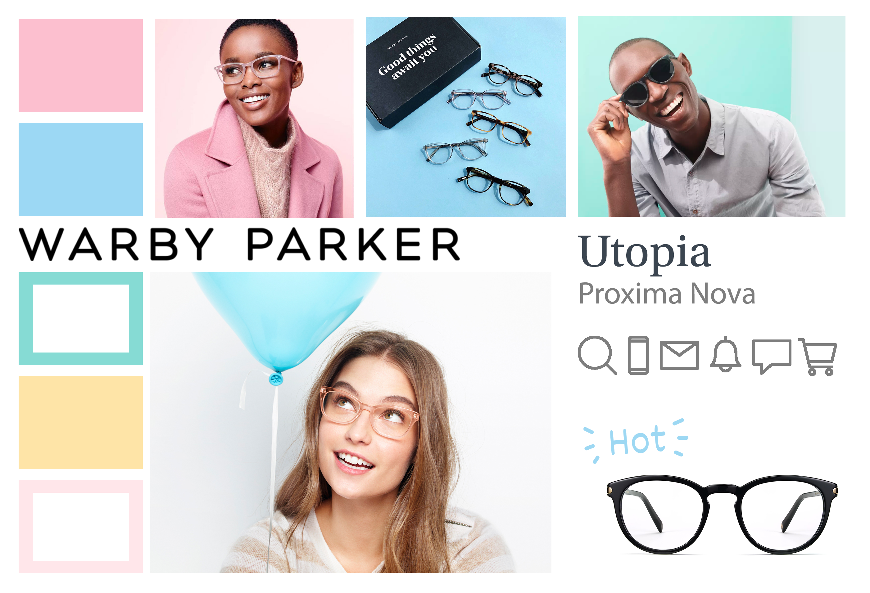
Before even starting on any actual visual design, I first read through the company mission statement that guided my own visual design strategy and then created a mood board to help me follow a cohesive design language throughout the project.
Leaving a trace
Keeping a trace of different layout options is important for helping evaluate which elements best fit the current design. Not destroying all your work and design explorations can help save time if a stakeholder prefers an alternative design to the one you're currently pursuing. Also a great way to get to show your process and how you arrived to your current design decision when looking for feedback.
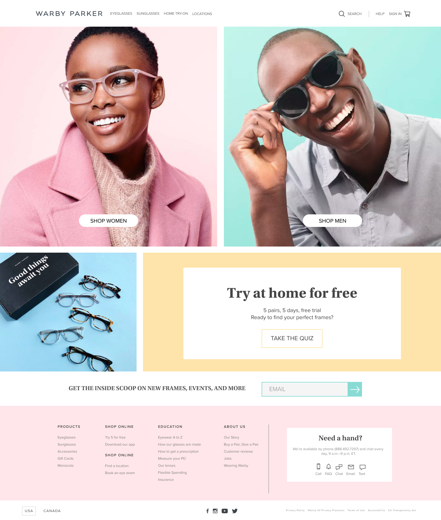
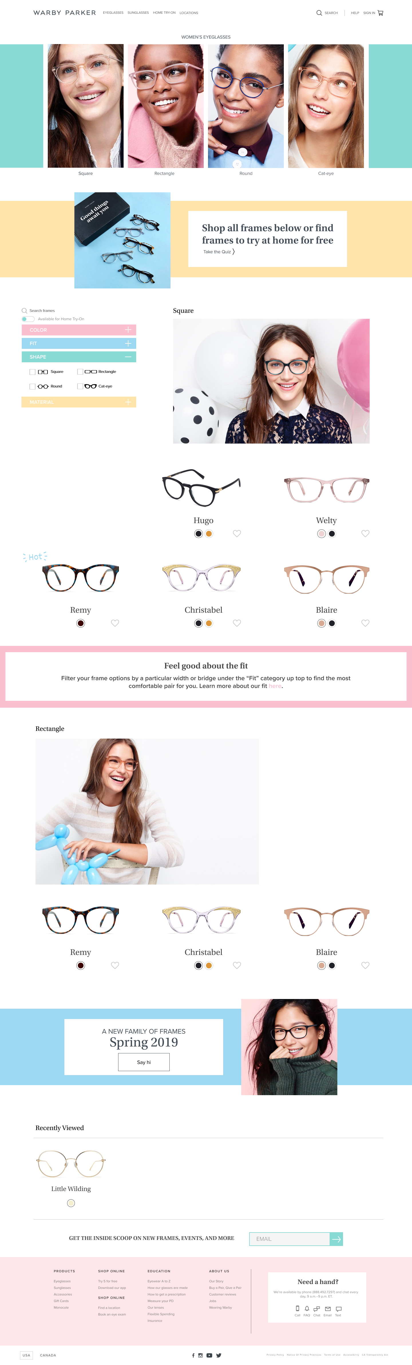
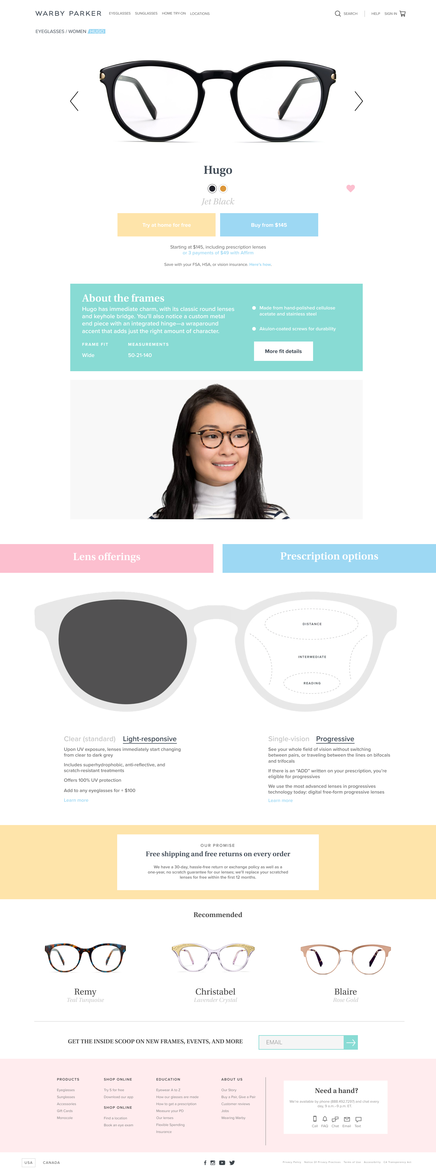
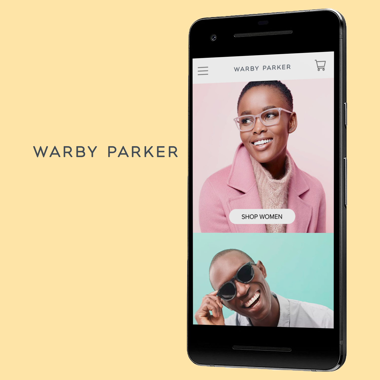
Final Design
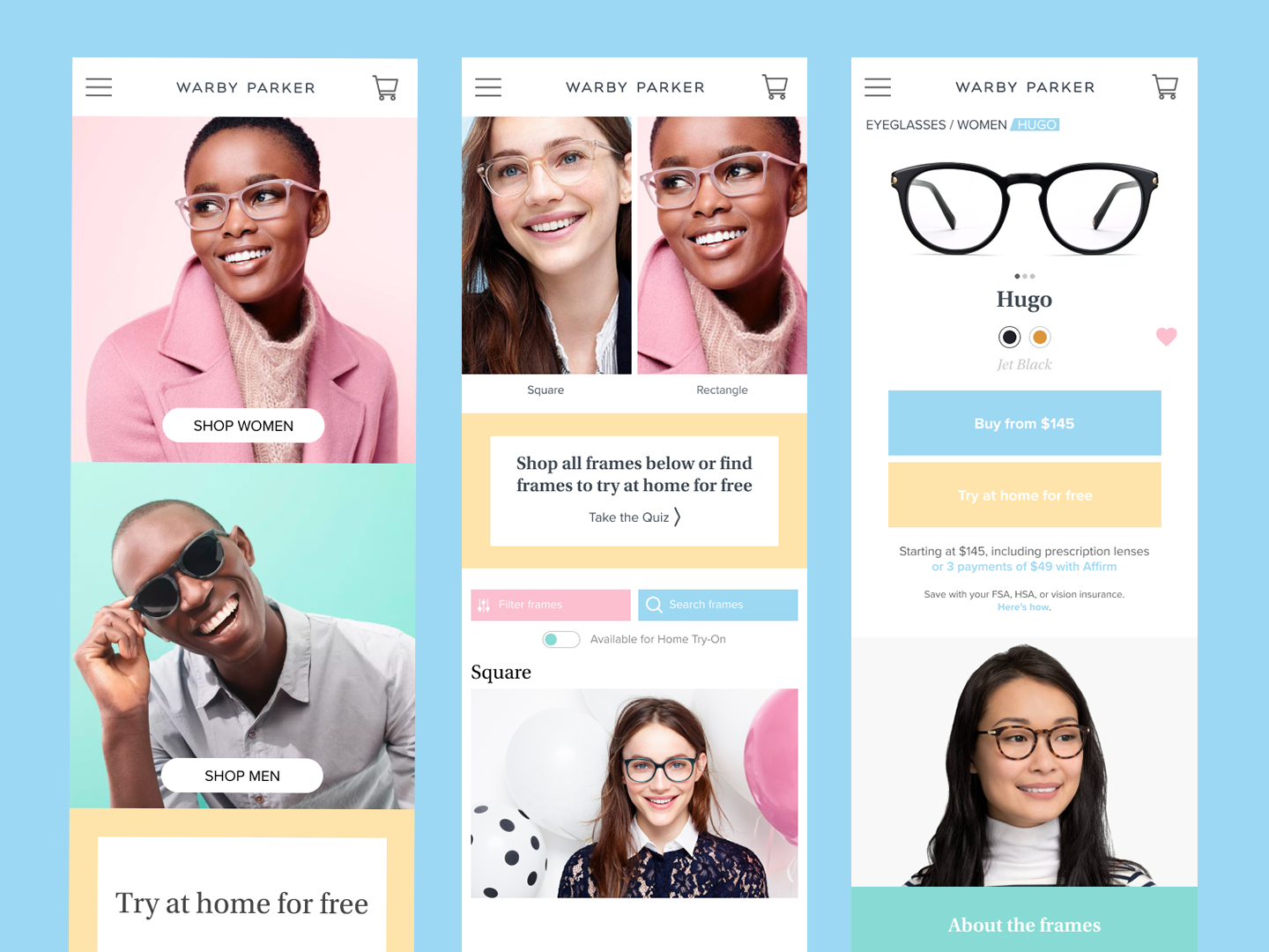
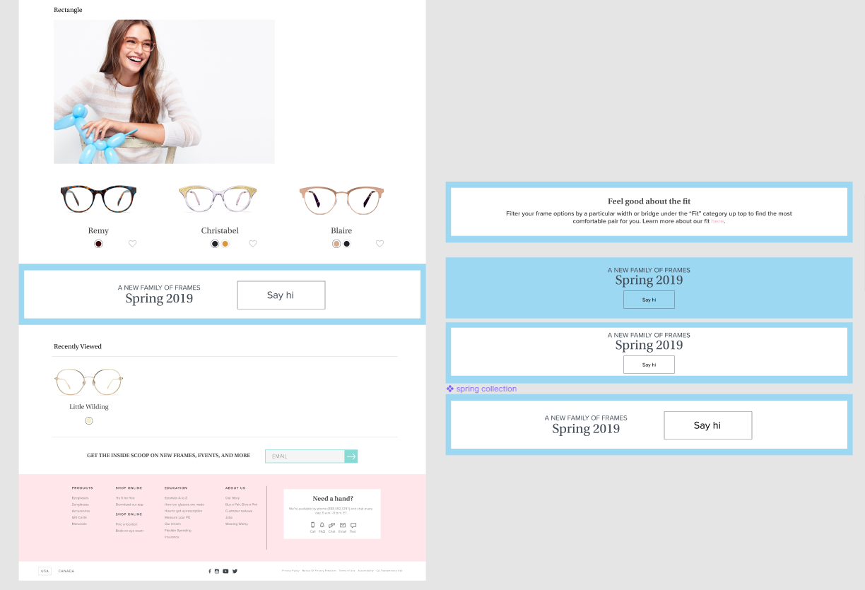
While sticking to my visual design goals, I had to redesign the homepage, product category, and product detail pages in both desktop and mobile screen sizes. Along with also learning how to create mobile mockups. This was the first time I learned how to make mockups from scratch in Photoshop.
Overall I really wanted to perk up the mood of the website, when I originally started this project in February 2019 I felt that the current website felt a bit bland. Sticking to the mood board I created, I utilized photography of much more energetic models and made use of brighter colors to bring life to each page. To also make things a bit more user friendly, I decided to add a recently viewed feature, something the website lacked at the moment of the redesign.
One personal struggle I overcame with this project was getting away from the source material and going for something more original. This was one of the major critiques I received in the design process. Part of me was attached to preserving certain parts of the existing branding to play it more safe, but I had to push myself out of my comfort zone for this project.