Redesigning hulu
Side Quest
objective
Create a new visual design strategy for Hulu
description
Second project in a visual design course focused on creating a visual design strategy to achieve an organizational mission. For the second project we were given a selection on brands to work on. I went with Hulu because I wanted to explore creating screens for the Nintendo Switch app.
party size
Solo
Duration
3 weeks
Role
Visual Designer
Rewards
+1,600 xp
+5 UI design
+3 Figma
+2 Photoshop
+1 Blob shapes
What defines hulu
Taking points from Hulu's career page to find what the brand values.
Why we exist
To captivate and connect people with stories they love by creating amazing experiences
Our vision
We aspire to be a must-have entertainment and technology brand that is celebrated for continuing to redefine TV. Operating at the intersection of entertainment and technology, Hulu has a unique opportunity to be the number one choice for TV in and out of the home.
Visual design goals
After understanding the brand values better, I'm able to set myself some design goals to focus on.
Number one choice for tv in and out of the home
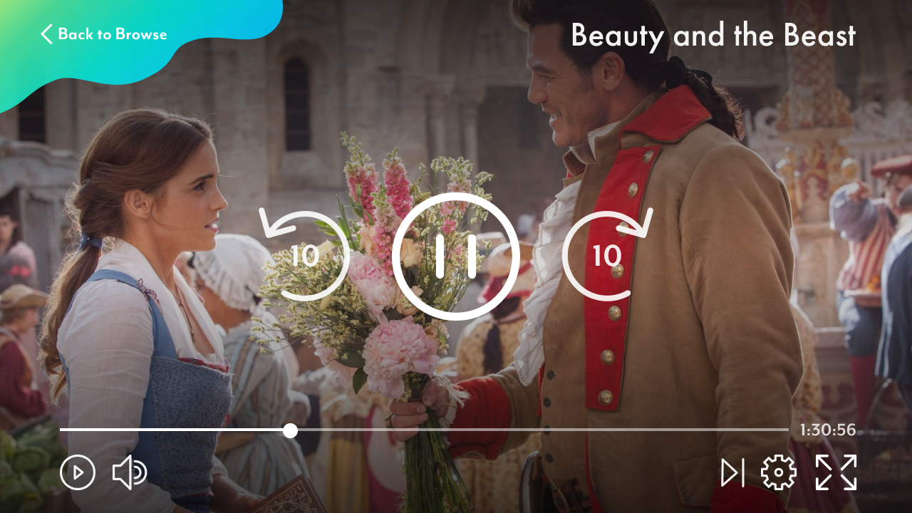
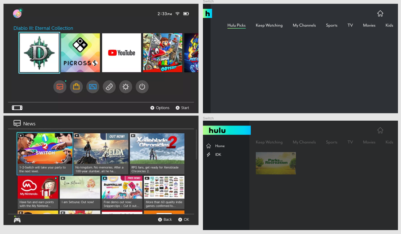
Create an experience that can be brought over to multiple platforms and devices so users can watch Hulu anywhere and anyway they want. Here I thought it would be fun to focus on Hulu for the Nintendo Switch for its portability and the unique viewing experiences the device offers.
User first
Always begin with the user in mind in the decision making process to captivate and create amazing experiences
Think big
Endless opportunity, unconventional thinking, creativity, and willingness to embrace risk
Design process
Before starting on any visual design, I first had to understand the company mission, come up with my own visual design strategy, and create a mood board to help follow a cohesive design language throughout the project. Made sure to include graphical elements, type, icons, color, and imagery elements in the mood board to capture the broad visual design for the project.
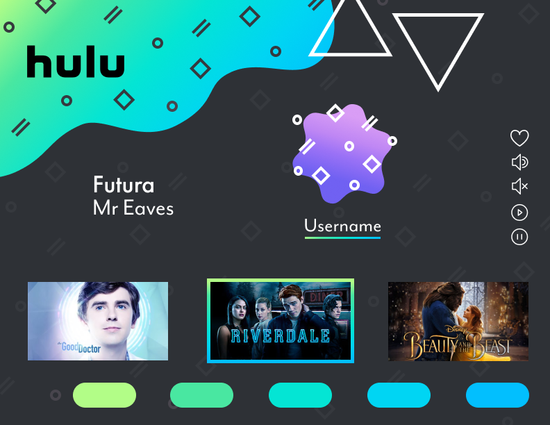
Based on the feedback I got on the last project, I really wanted to aim for something more divergent from the current brand design. This gave me the opportunity to work on my confidence with creating vector shapes. I never really was friends with the pen tool before.
Below is my inspiration workspace. On the left you can find different designs that inspired me, while on the right I practiced creating different shapes and layouts.
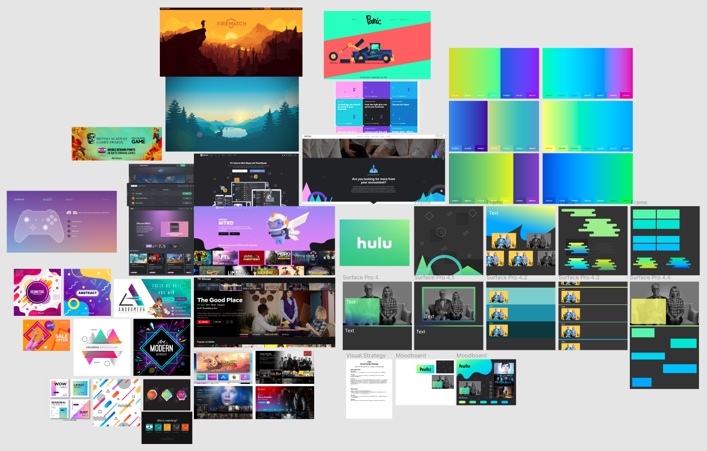
Exploring and preserving different design alternatives is an important part of my design process. Creating copies of an element and exploring design possibilities is a great way to easily compare different designs and preserve your design efforts if you need to go back to a previous stage in the design.
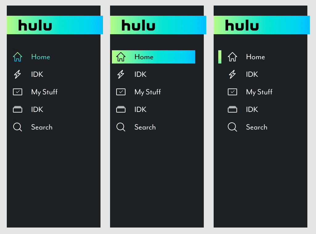
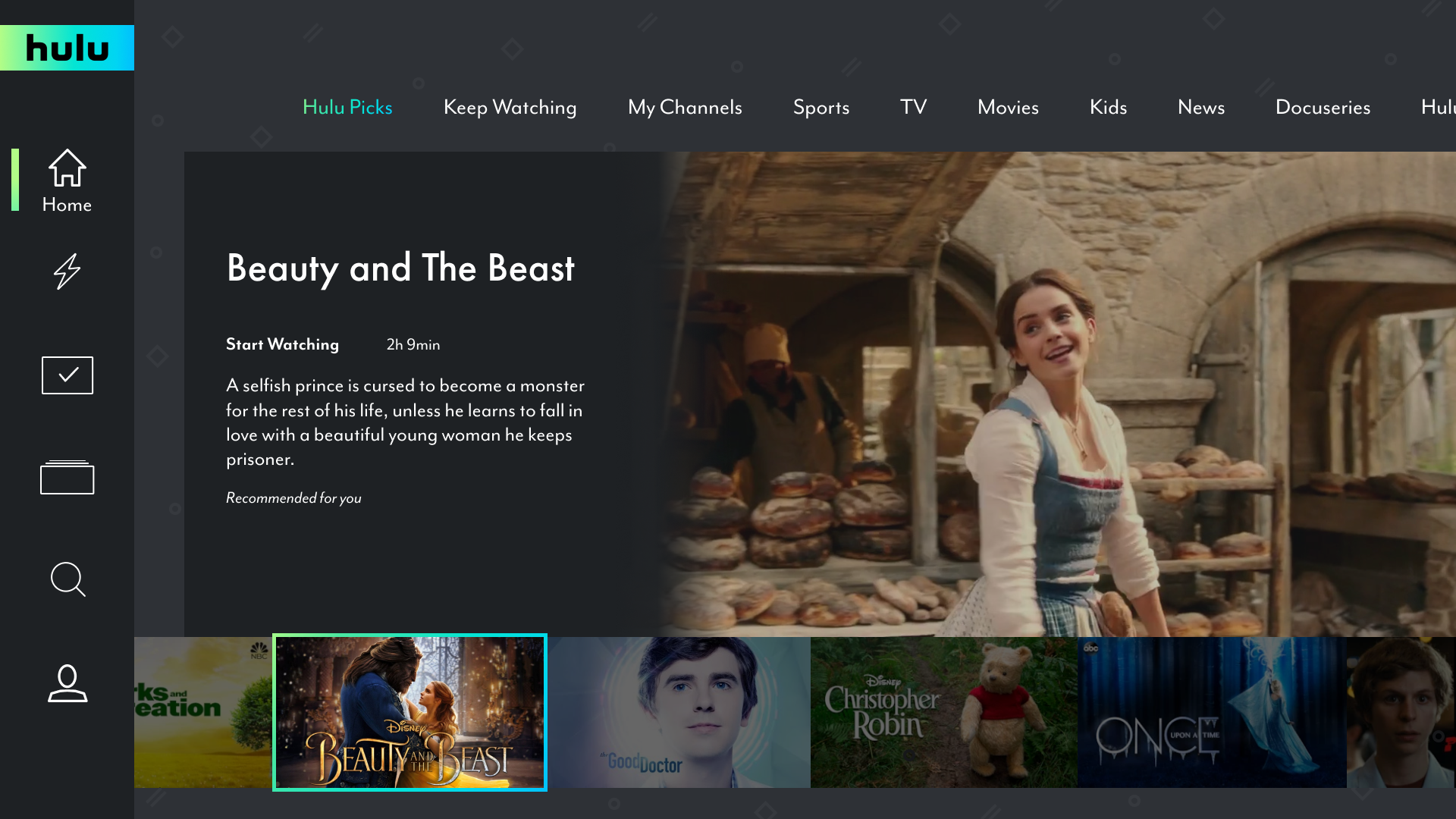
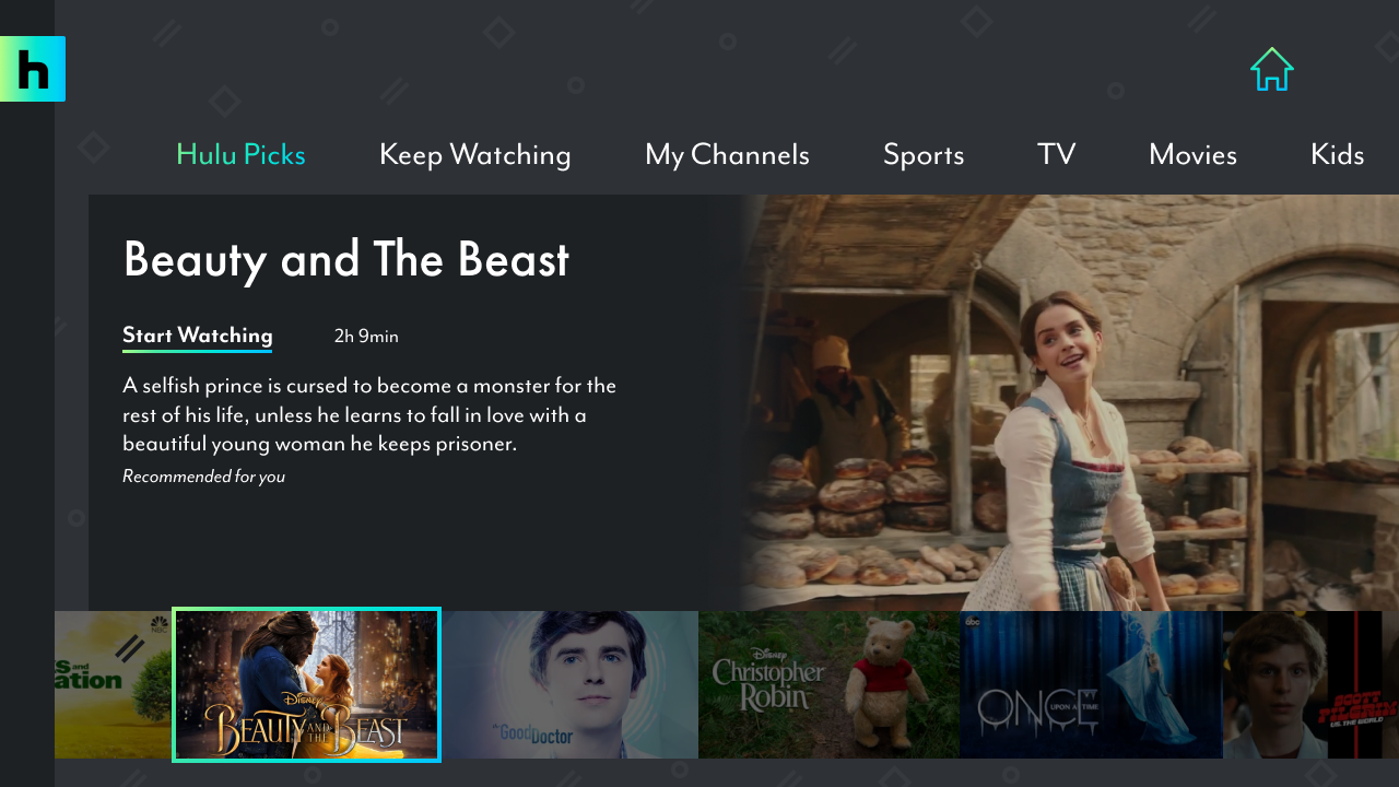
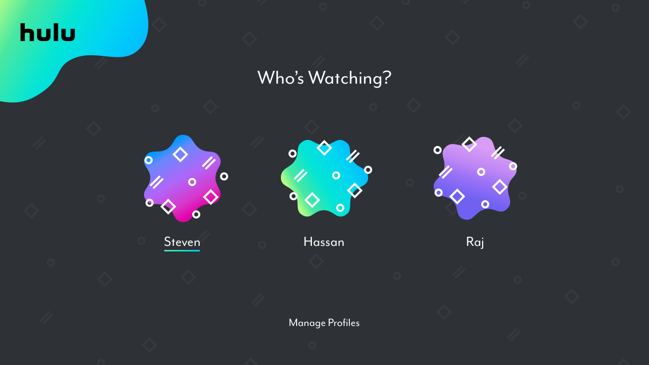
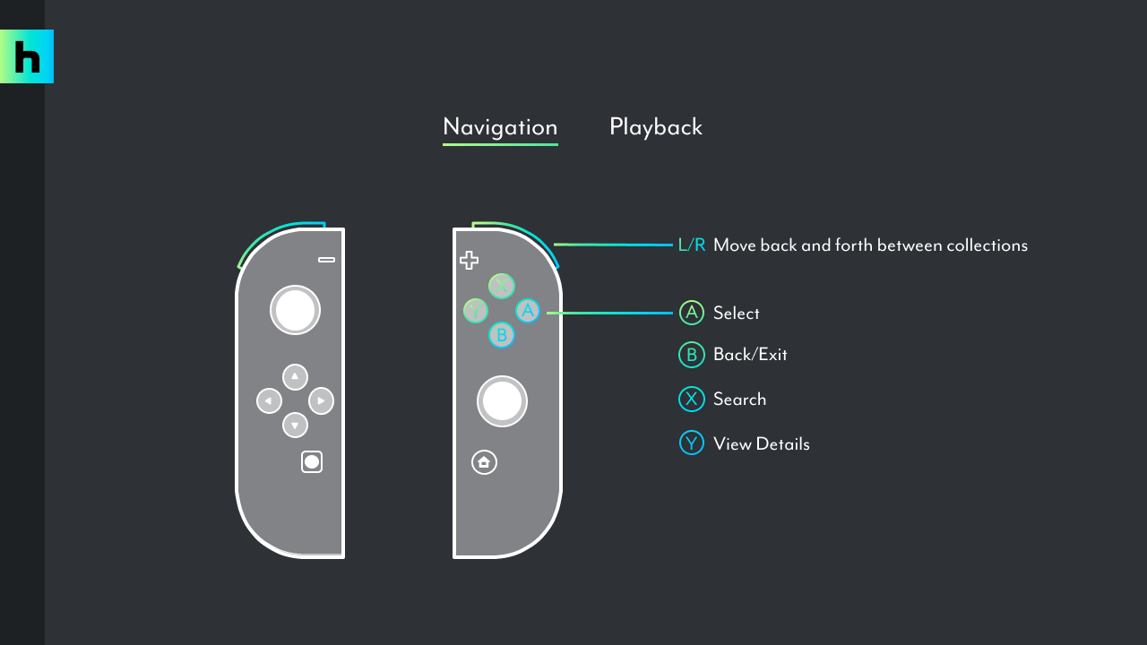
Since I was designing screens mainly for the Nintendo Switch, I would often refer to the home page layout to help keep elements proportional. It's important here to keep in mind that on the Nintendo Switch one can navigate using the controller or the touch screen.
Final design
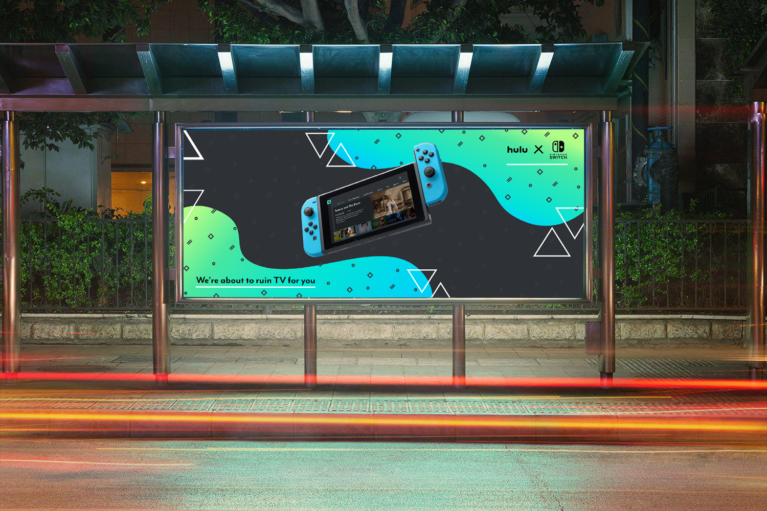
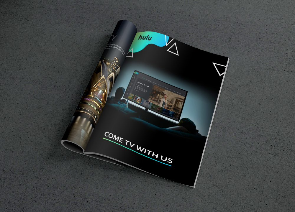
Mainly focusing on screens for the Nintendo Switch Hulu app along with mobile and TV layouts to meet project requirements. In addition to digital screens I also had to create two non-digital mockups. I had a lot of fun challenging myself and learning how to make use of Photoshop tools to align my designs to fit over a folded magazine page. I could have used a template here but like learning about how things work and I feel like it could be a useful skill in the future.
This was a very interesting project to work on for me. I got to play with a fun design style and get more comfortable working with vector shapes. One of my most well received designs was a poster I created for one of the non-digital mockups. With that one I really left my comfort zone of the last project and experimented a lot with balancing many different visual elements to create something visually fun. I'm really proud of the work I did here.